
A Detached View of Bitcoin
Dear Readers,

The year rolls on, and so does the chart. Any objective observer of the chart, unfamiliar with the market and not being caught up in it, will no doubt wonder what the panic is regarding price [yes, people can be emotionally detached toward Bitcoin]. Their initial impression of the chart would be a visual one, seeing a regular series of moves and corrections, and they would most likely incline toward seeing the price currently at the end of yet another correction.
And yet most of those more closely tied to the market, watching its every daily move in price, are currently in a state of near panic. The explanation of this phenomenon in my opinion is collective/ crowd sentiment on the one hand, and ‘money illusion’ on the other.
The investor is not interested in some abstract price point, either peak or low, but rather on the potential return [or loss], the ROI [Return On Investment]. The investment is relative to the entry and the exit, and the return, in percentage terms, between these two points. The actual price of the instrument is irrelevant [buying into a high nominal price/ FOMO is a variant of money illusion]. What matters is the appreciation or the depreciation of the instrument that one is speculating in, and, as discussed in the previous article on money illusion, the reason why Crypto-currency moves exponentially is due to the available money/ capital on the sidelines looking to be ‘put to work’.
And so to technical analysis on the chart, which ideally should give us that perspective of the objective observer that has come to the market for the first time.
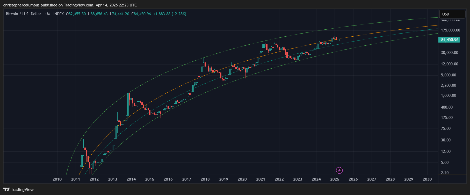
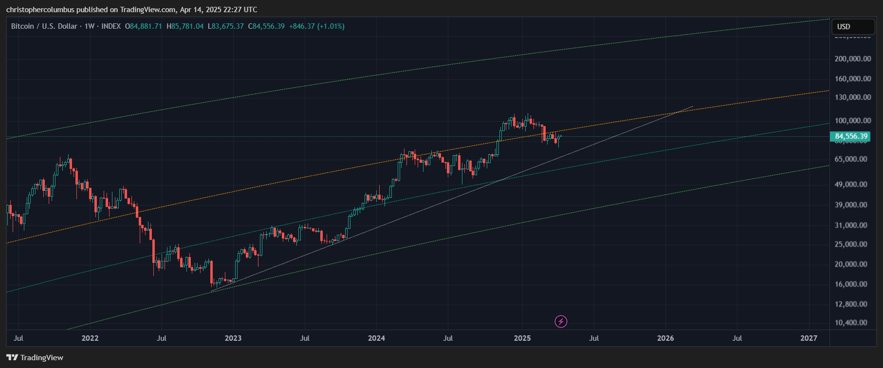
Visually, the first fact that would strike our detached observer is that price is pushing all time highs… with it in an uptrend and higher than the previous cyclical highs. No doubt with his curiosity piqued, he’d want a closer look at the price action; indeed, wondering whether to get in on such action. And so to the weekly chart below.
With a simple multi-year trend line drawn, our ideal observer remains interested - price is half way through the long-term channel [LGC] and maintaining a relatively steady rate of appreciation. Now, with interest increasing, he no doubt will look more closely at the technicals.
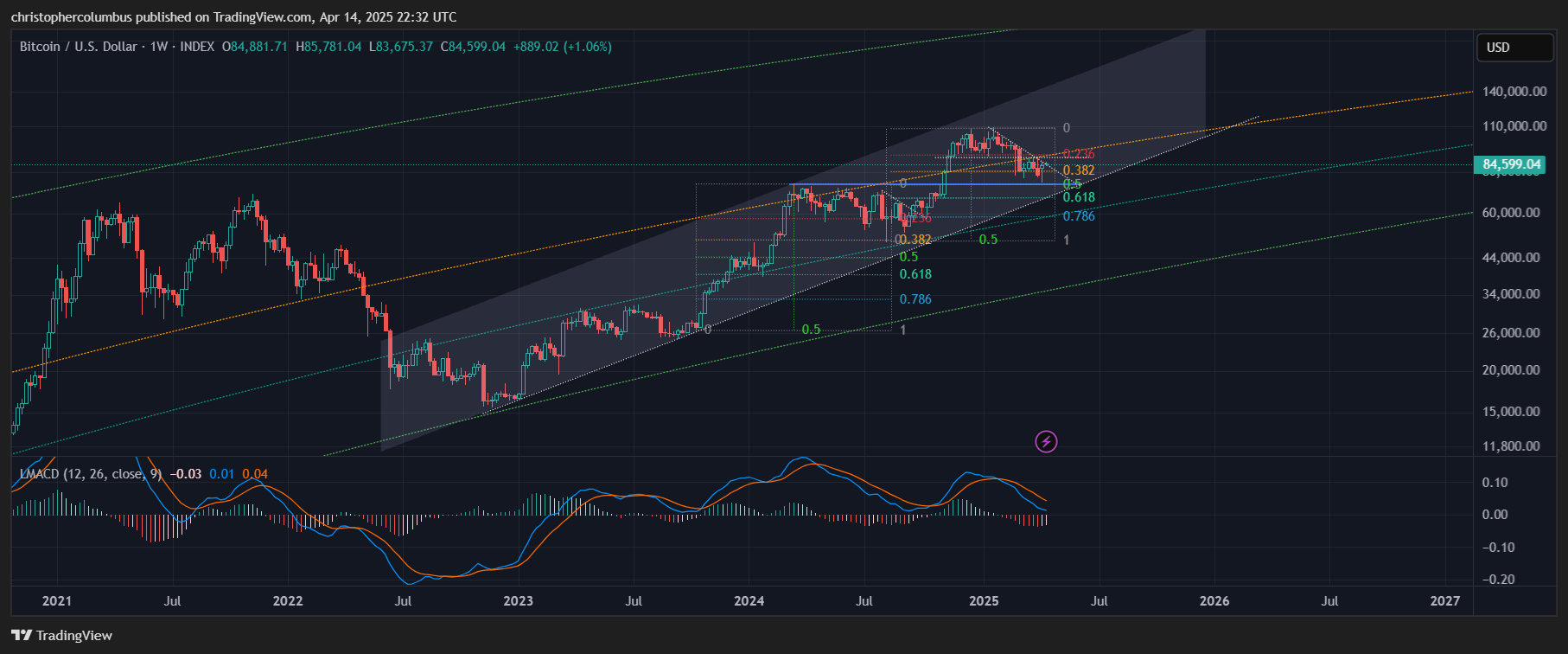
He now sees a technical channel rising within the greater multi-cyclical LGC channel, previous resistance coming support [blue horizontal], and a solid fib retracement of the recent move up… and as comparable to the previous correction.
Add to that the weekly MACD, a momentum indicator, and the suggestion is that the correction has largely played out, where the histogram is now contracting, and the MACD itself turning upward after having first retraced/ re-set back down to the zero-line. Of further interest is that the MACD has not been below the zero-line [technically, bear territory] since February 2023 suggesting a multi-year ongoing bull market.
Extrapolating the technicals, our ideal observer might suddenly turn buyer and think a risk-managed entry, if having no exposure, might be a reasonable decision to make. And especially if that risk management also considered a BTC position as a diversification of currency holdings, away from USD in uncertain macro and geopolitical times [digital gold].
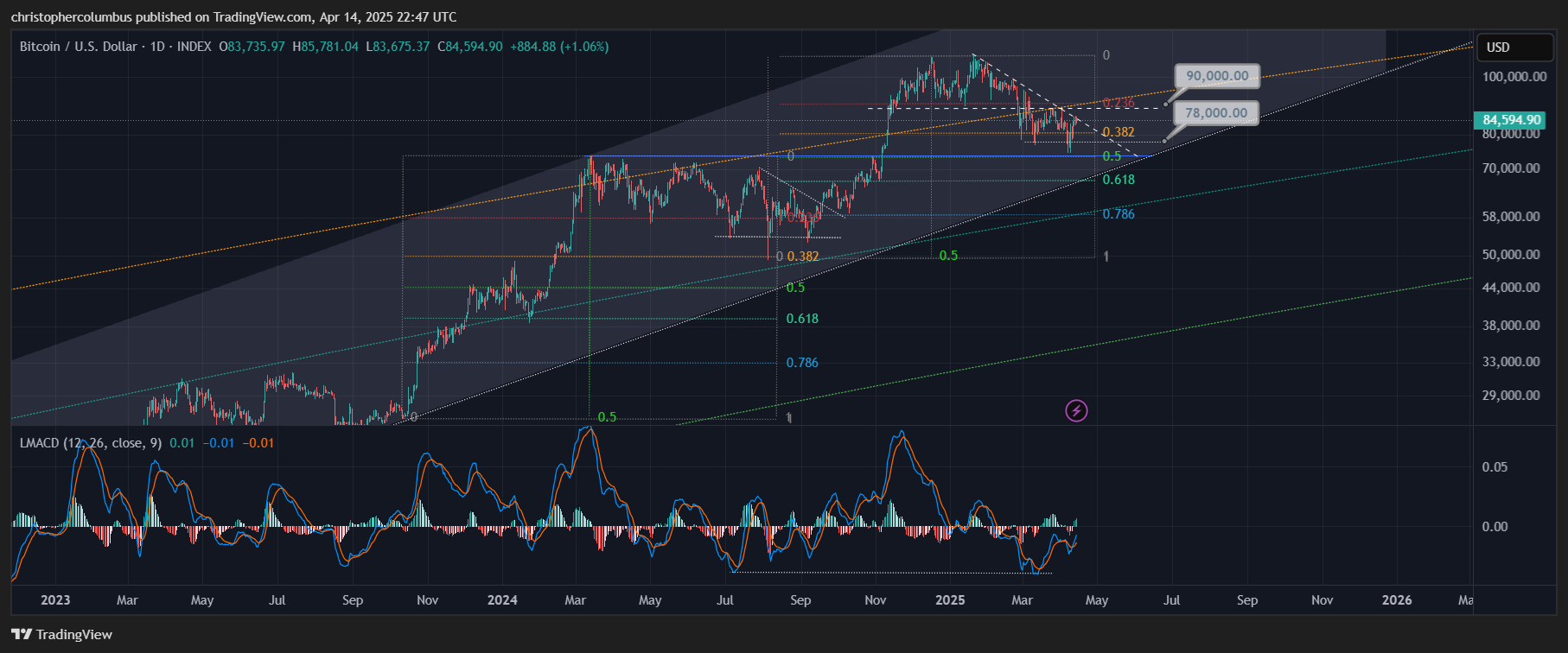
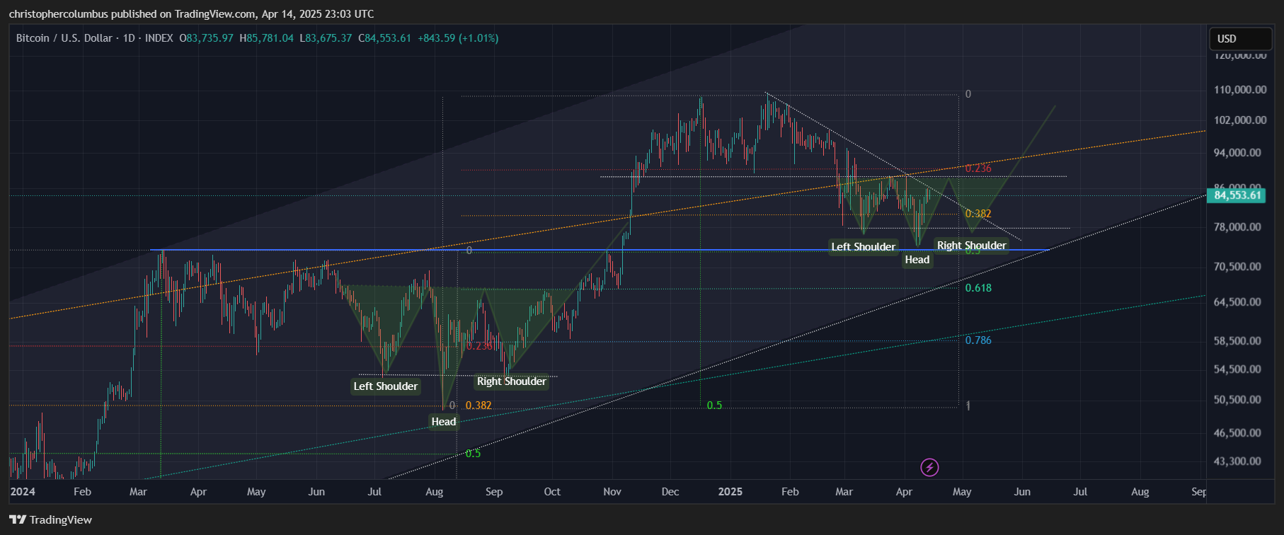
On the daily chart, further zoomed in [while not too far zoomed in to the point that TA loses its efficacy], the diagonal of resistance is the first technical to pressure price, followed closely enough by the horizontal to in turn make the diagonal redundant.
The buyer would then be looking for 90K to break before entering, to safeguard against further upside in price. This also leaves open the option, should price find resistance at 90K, to buy a retest at say the 78K area [with a comparison to the previous correction in mind].
The prediction involved here, with a basing volatile price moving within a range, can be portrayed as the well-known reverse head and shoulders pattern. A pattern that is often found when a market is finding its base before moving higher. Indeed, something like this pattern was found in the previous correction as seen in the following chart.
Our detached observer, being obviously a late-comer to the market, would likely warm to the idea of buying based on the technicals. The paradox is that those that have been in the market for years are almost panicking at this juncture.
As mentioned earlier, I think this is primarily due to a negative collective sentiment, where previously most market participants had an initial too great an expectation. The negative sentiment is due to a disappointment of that expectation. Contributing to the negative sentiment is a disregard of the technicals, where there was more of a focus simply on time, on cycles, and the expectation of the current cycle being commensurate with previous cycles. This did not take into account either the notion of diminshing returns or the idea of a qualitatively different maturing market.
Those that had a more sober and technical view of the way in which the market could well develop [while also allowing for the possibility of a parabolic spike] are not so disappointed. Rather, it’s a business as usual kind of approach, which also is likely to apply to the new-comer that has experience with other markets in my opinion.
Until next time,
Stay [relatively] safe out there,
Dave the Wave.