
BTC MACDs/ Momentum Indicators on Various Time-Frames Updated
Dear Readers,
Time grinds on, another fortnight, and now well into the second month of the year, where an expected renewal of the bull market in BTC to come later in the year [yes, we are in a bull market].
This fortnight will look at an update of the MACD on three time-frames; the daily, the weekly, and the monthly. Given the principle [from an earlier article] that the longer-term time-frame has more technical weight, the later of these will be the most significant.
But the reader may be left wondering how drawing a few lines on a chart could equate to an empirical science. To which I’d reply that the crucial factor here is time. If time were to be placed on a spectrum, with the shortest of periods at one end and the longest of periods at the other, randomness and possibility would belong to the shortest periods, while pattern and probability would belong to the longest periods. There would be varying degrees of probability/ randomness depending on what point of the spectrum you were dealing with - at the one end, minutes would be near completely random, at the other end, years would have a much higher degree of probability. Just as with any science, where momentary observations only start to make sense when accumulated into a mass over a longer period of time, so too with T.A. It applies most effectively to longer time frames, where lines might be drawn, and trends discerned.
The Daily MACD
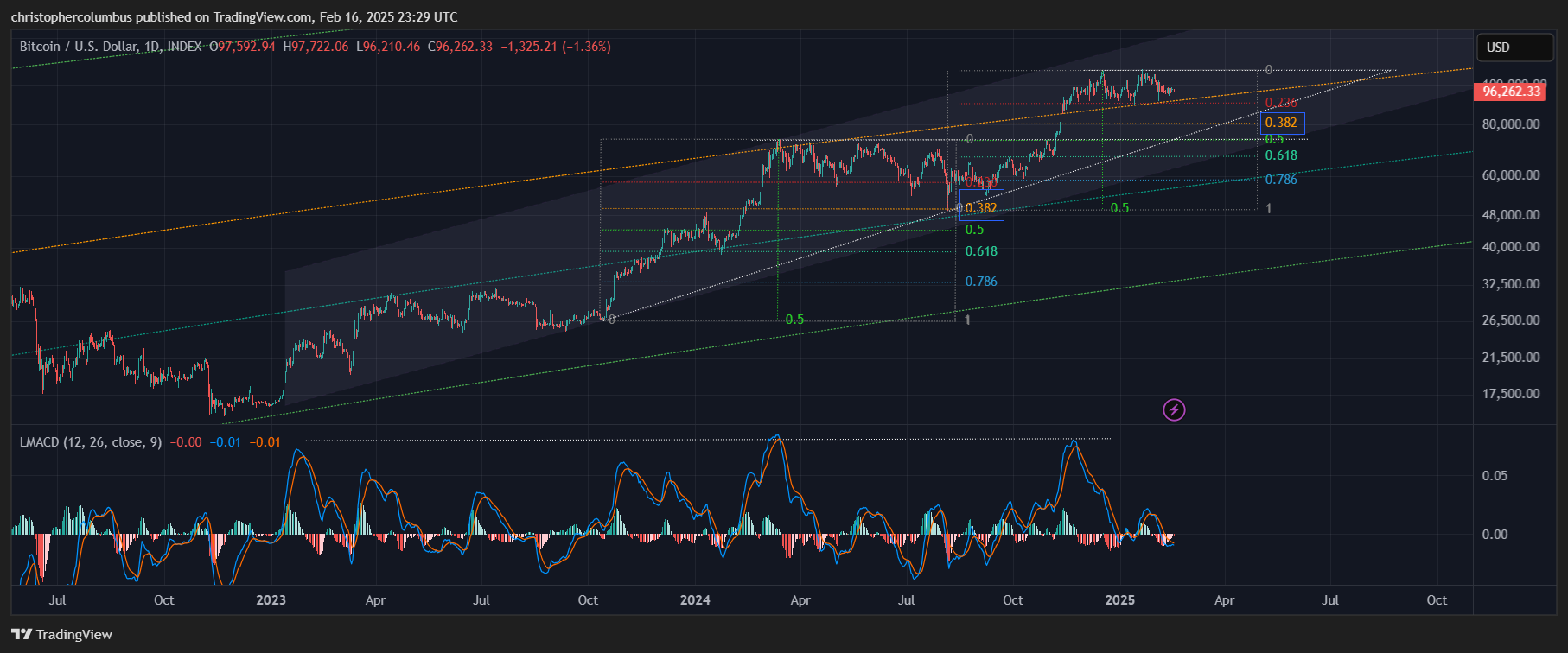
The MACD on the log function is effective on the daily chart in identifying and comparing volatility more so than longer-term trends. What’s of interest is that the MACD has peaked out at a certain level previously, and so too has bottomed out at a previous level.
This suggests some further consolidation in the shorter term, which would be no cause for alarm for the longer-term. Such a move, say into the 80-90K range would in technical terms be considered healthy, and in turn set up for a renewed push to new highs.
Must this happen? No, of course not. But in portraying the probability of it happening, panic is avoided, and so too the selling at the wrong time. The boy scout is always prepared.
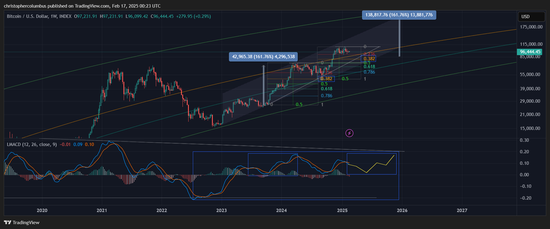
The Weekly MACD
Zooming out to the weekly chart, and decluttering it a little, we have a weekly MACD full of information. As more recent price action interests us more than from ten years ago, almost ancient history in BTC terms, it makes some sense to zoom back in a little as per the second chart below… especially when we consider the market is ‘maturing’. From a previous article:
This first article of the new year will focus on what has to be something of an anomaly in price action as compared to previous multi-year cycles. It will look at the relative stability of price, its movement as technical as opposed to parabolic, and tie this back into something I’ve been mentioning and predicting for quite some time now - a qualitative change involving a maturing market.
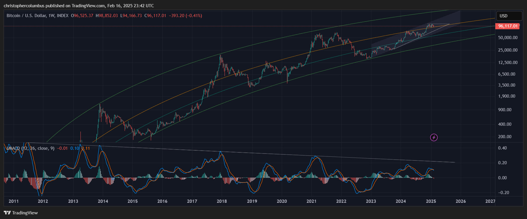
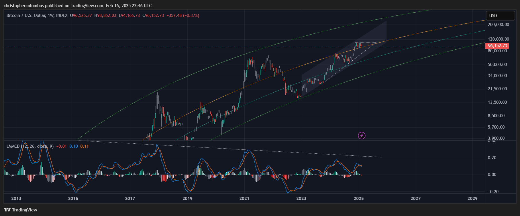
Noticeable at first sight is the MACD cross. Once again, no great cause for alarm if this is considered Bitcoin normal when looking at the previous technicals of the past two years - healthy consolidations after large moves up.
Supportive of this outlook is price midway in the technical channel [shaded area] moving up, and the longer-term trendline also coming through in support… with plenty of room currently between it and price. Once again showing that a consolidation to the 80K range would be fine [without of course stating it as a necessity].
Given the technical set-up, and once again focusing on that crossed MACD, there is a good chance of it near re-setting to the zero-line. This would in turn set momentum up for a push through to those new highs we are looking for later in the year.
At first sight, the projected target of the MACD looks low [when taking into account the diminishing macro volatility that the upper trendline represents]. And yet if price action/ the market is maturing, BTC may no longer require those parabolic moves to achieve those high prices we’re looking for… as per the following chart.
Even a decline to say 85K would set up for a solid target on a repeat of the weekly MACD pattern that would not require the MACD going too high.
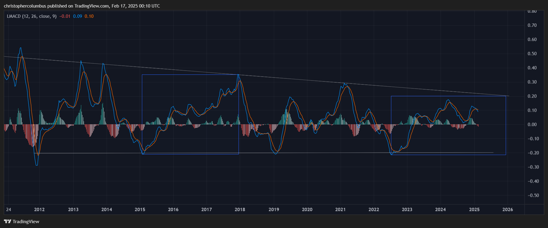
The Monthly MACD
For the investor, the monthly chart is the proper one to pay attention to in my opinion. It functions to both smooth out the volatility on the chart and the emotions that can often get the better of us. Instead of the pilot that flies erratically by the seat of their pants and reacts to distorted momentary perceptions [daily volatility], we orientate ourselves to the instruments that provide the ‘horizon’ of the long term chart.
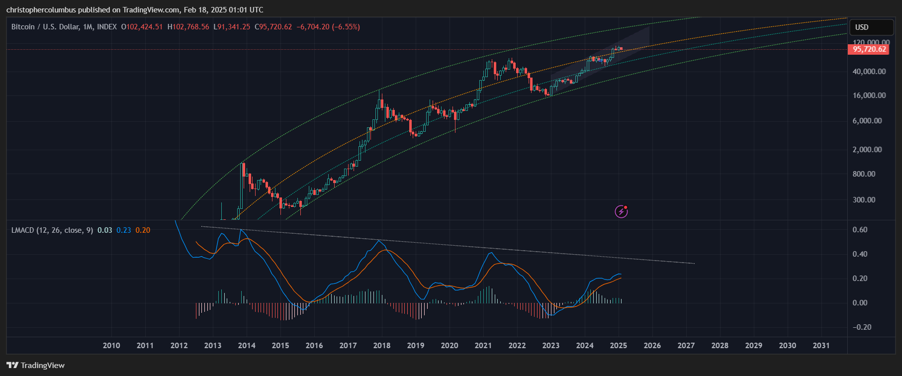
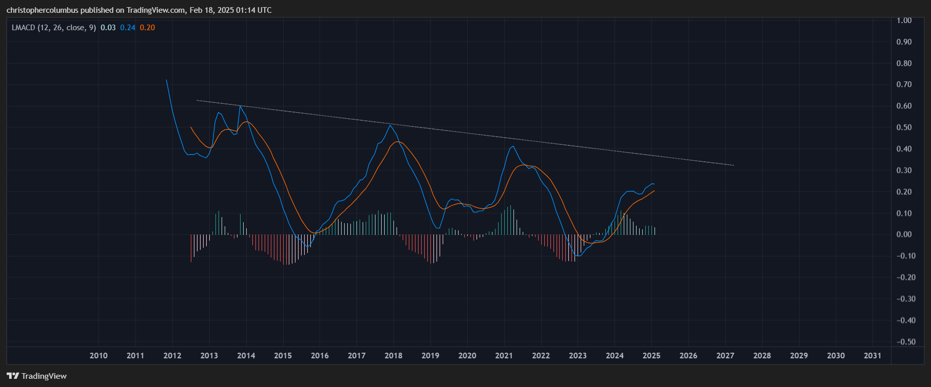
The monthly MACD here is the most significant one, in terms of both time and trend. Unlike the consolidation seen on the weekly MACD, where the MACD has crossed its signal line, the monthly MACD remains bullishly above the zero line, signaling a continued bull market.
The MACD is also signaling further correction as it rolls over to threaten once again a meeting/ kiss of the signal line. It remains high above the zero-line while, in turn, plenty of space remains between the MACD and the longer downward trendline. This downward trend in the MACD denotes reducing macro volatility and a maturing market in my opinion, something that’s reflected in the price action of the LGC [logarithmic growth curve].
In summary, there are no alarms and no surprises to be found in the monthly most significant MACD as yet. Rather, we see a business as usual mode as far as a multi-year bull market is concerned. That price action is tighter in a more technical range, that the macro volatility is reduced, is something that was expected to develop given the notion of a maturing market.
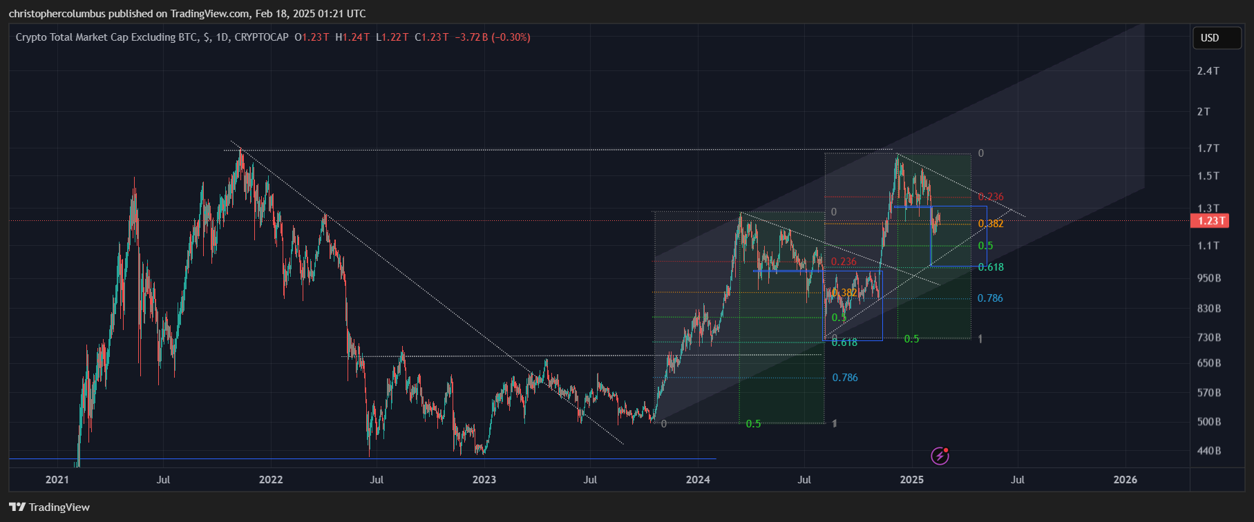
Finally, what about alts you might ask? I find this alt market cap comparison of interest, and perhaps of some encouragement for those in an overly despondent mood.
Until next time,
Stay [relatively] safe out there,
Dave the Wave.